June 22, 2022
Guest post by Jamie Sandison
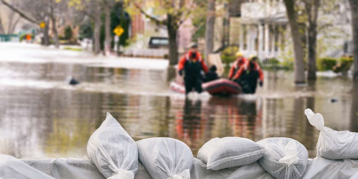
For most Canadians, climate change can feel shapeless. We know dangers exist somewhere in the future, however, solutions in the present seem few and far between. Yet, Canadians already face growing risks from climate change in every corner of the country. From 2010 to 2019, it was estimated that climate change-related disasters in Canada have caused over $18 billion in private and public damage costs.
British Columbia experiences catastrophic mudslides due to “record-breaking rainfall”. The Prairies endure more smoke-filled skies due to “extreme wildfires”, a partial effect of “extreme drought conditions”. Each winter, the Maritimes live through costly power outages due to “more intense storms”. However, even in the face of such growing impacts, climate change is mostly viewed as something “far away in time and space”. Experts increasingly think the key to raising awareness and enhancing risk perceptions is through innovating our ability to communicate climate change in a meaningful way.
This has given rise to interactive webpages – online tools that show complex datasets and the human stories that are connected to them. Interactive webpages about climate change, or climate risk tools, aim to close the distance of climate change for everyday people by reshaping complexity into clear narratives through text, maps, and visualizations. Used by the New York Times, Bloomberg and Washington Post, climate risk tools in the United States are abundant. In Canada, however, climate risk tools are not nearly as common, even though many climate risks are multiplied for Canadian communities. What are Canadian tools missing, and what can we observe in current tools elsewhere to address this gap in communication?
As part of a masters research project funded by Smart Prosperity Institute through the SSHRC-supported Greening Growth Partnership, we analyzed 14 publicly-available interactive climate risk tools with an original evaluation methodology to document features, focuses and trade-offs across the sample. More specifically, our research questions were:
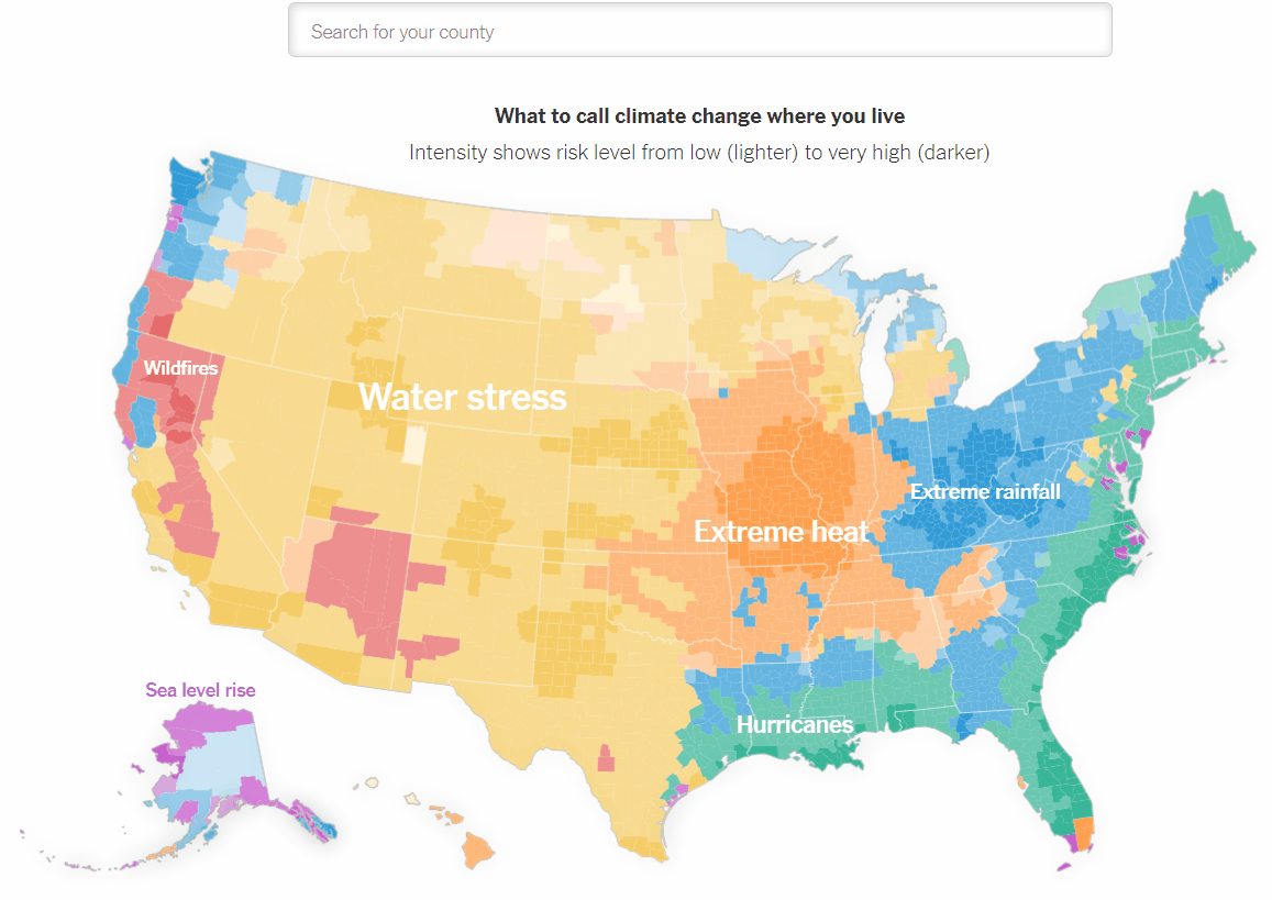
To figure out what research is relevant to climate risk tools, we selected a sample of tools (n=14) and categorized their overall content based on three fields of literature: risk, climate change communication and data visualization. Next, we created a set of research-supported criteria for each field and listed them into an evaluation matrix, termed for this study as the Climate Risk Tool Matrix. Risk is notoriously complex to define, so we followed the design of models used by the Intergovernmental Panel on Climate Change, known as integrated assessment models. These models connect economic and climate data together to assess human influences on the Earth and how likely impacts are to occur. Economic Risk covers criteria based on historical-looking data while Climate Risk covers criteria based on future-looking analyses. Climate Change Communication evaluates how tools shape climate messages for individuals, communities, and mass audiences. Data Visualization covers all interactive features in climate risk tools and evaluates how the visual nature of tools blend with practical graphs, dropdown menus and map interfaces. A tool that captures many themes in all three fields of risk, communication and visualization is the New York Times Climate Risk Map, pictured in animated images below.
The sample is a selection of currently available public tools that range both in subject matter (flooding, wildfire, sea-level rise, etc.) and location (United States, Australia, Indonesia, and Canada). As a representative selection, most tools are from the United States, and only two Canadian tools were found and selected. The Climate Risk Tool Matrix was used as a checklist of whether a given criteria in either risk, communication or visualization was either ‘present’ or ‘absent’ in observing the tool. This methodology was used for each tool in the sample to observe features, tool focuses and trade-offs in each category of criteria.
Out of 14 tools, only 1 was able to capture all criteria in the Climate Risk Tool Matrix. Surprisingly, most of the sample struggled to achieve a similar degree of well-roundedness, as most tools only achieved a middle to low ranking in the risk category. Many tools are seen communicating climate change in a highly visual form, but most fall short of showing actual risk information that is relevant to economic or climate-related circumstances. Another finding is that the two Canadian-focused tools fell short of reflecting a range of key criteria in all categories, suggesting that practices implemented in higher ranked tools have yet to be used in Canada.
To fill this gap, key practices and features that captured criteria across the sample were observed. We synthesized key practices for risk, communication, and visualization from FloodFactor.com, Bloomberg Cities Hit Hardest, and Hell and High Water, respectively. These tools hold considerable knowledge to fill what’s missing in Canada and can help address this major gap in communication. Specifically:
There is much to learn for Canadian tools – we can see we’re only scratching the surface of what can be done to enhance communication of climate risks. That said, if only a few improvements provided by the Climate Risk Tool Matrix are deployed in new tools, Canadian communities will have a better chance to understand climate risk and take action. British Columbia residents could find and understand future flood risk in their area and choose what home or place of business is least likely to flood. Winnipeg and Toronto residents could understand how future smoke-filled skies can affect their long-term health and what steps they can take to prevent adverse effects. Halifax and St. John’s residents could understand how more frequent and severe Atlantic storms will affect their homes and community. It’s clear more can be done to communicate and create opportunities for individuals, communities, and governments to make decisions towards resiliency and adaptation. By pushing forward innovative communication tools, we can reveal the risks we already face and prepare for the future.
Go to www.climaterisktools.ca to see the Climate Risk Tool Matrix interactively with tool demos, animated examples of features and detailed information generated by this study.
Jamie Sandison recently completed his Masters in Environmental Sustainability at the Institute of the Environment through the University of Ottawa. His research focuses on gaps in risk and communication for climate-related hazards in Canada. Jamie’s passion for climate change, communication, and technology led him to be a self-taught web developer; he continues to create and publish personal projects through LinkedIn and Twitter. Contact: sandison.jamie@gmail.com
This work was also supported by a student internship from The Co-operators.

EEPRN and Greening Growth Partnership Student Researcher 2020-2021
©2026 Smart Prosperity Institute. All rights reserved.
Contact us:
info@smartprosperity.ca | 1 Stewart St (3rd Floor), Ottawa, ON, K1N 6N5